Interpretive Graphics: Charting both the Forest and the Trees
Catherine Gilman, Desert Archaeology’s graphics and mapping specialist, writes this week about innovation and collaboration in creating interpretive graphics.
Readers need visual guidance to gain purchase on the science we produce. Making ideas approachable through better graphics is a good way to reach beyond the specialist’s view and into the minds of those we’d like to inform.
I work at Desert Archaeology. The phrase might invoke images of shovels raising plumes of wind-blown dust in 110-degree weather, or, for the more fanciful, fedoras and punching Nazis. People who volunteer with us have memories of trowels repetitively scraping dirt, hoping for nothing more than a subtle change. But there’s a steady light in the eye of someone on the hunt for new proof of how people lived before. When the trowel clinks against a buried cobble, the mind supplies a catalog of possibilities from donut stones, to effigy pots, to the turquoise-encrusted golden death mask of Montezuma.
Behind these sweaty scenes are archaeologists who sit in air conditioned cubicles and crunch numbers. They, too, look for nothing more than subtle changes. And when the numbers expose new ways of thinking about those who lived before, their eyes gleam like Montezuma’s gold.
Data tables, like buried cobbles, never make it into museums. A table becomes an appendix few will read, tucked into the back of a report. A less bulky table may be included in a chapter within that report, or might even make it onto a PowerPoint slide shown to colleagues, academic advisors, or sponsoring agencies. Presented in these ways, potentially ground-breaking information may be quietly absorbed into the knowledge base of specialists. Or it may be missed altogether.
But what if a graphical interpretation could make an impression as vivid as a gold-encrusted mask? What if the data could be understood in ways a thousand rows and columns could never reveal to the non-specialist? What if the big idea behind the data could reach The Public? While we can’t claim to spin every data set into solid gold, I do my best with the old adage: a picture is worth a thousand rows and columns. Graphical illustrations of data have become a favorite specialty.
For this blog, I’ve collected a few charts—used by various archaeological contributors to explain the importance of their tree and plant research—to show how I transform them into visuals that make it easier for all readers to grasp their significance (click any image to enlarge and zoom).
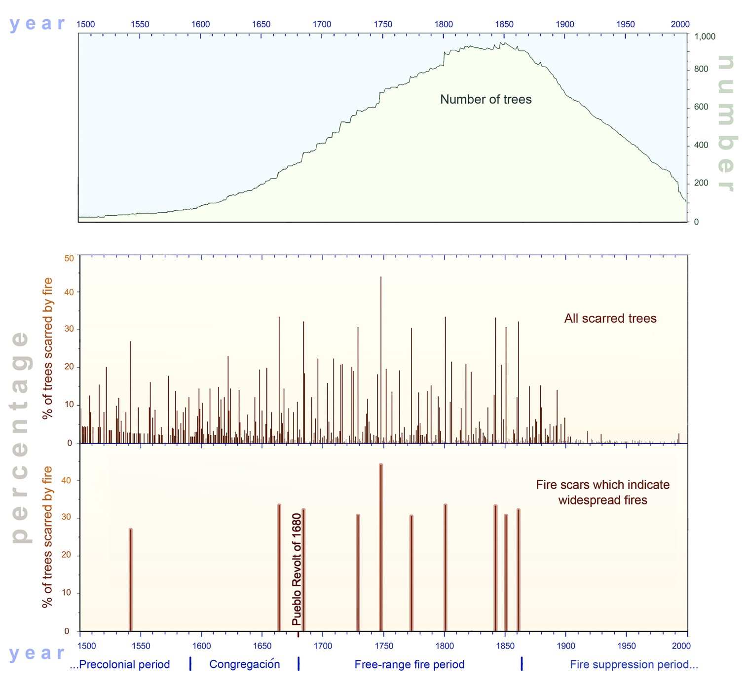
A case in point is this time-honored format for dendrochronological data (dating events with reference to tree growth rings):
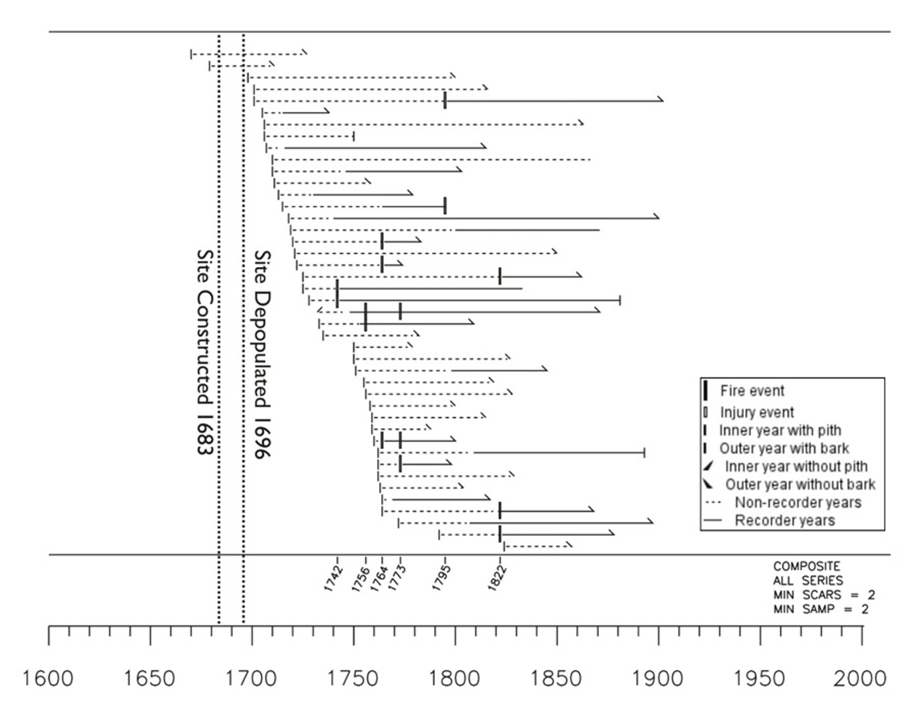
This chart shows a variety of things that are important to the dendrochronologist’s eye. They may rapidly accelerate the specialist’s heartbeat, but probably leave the rest of us clueless.
Here’s a presentation of the same data in a more intuitive graphic design, made possible with the use of AutoCAD:
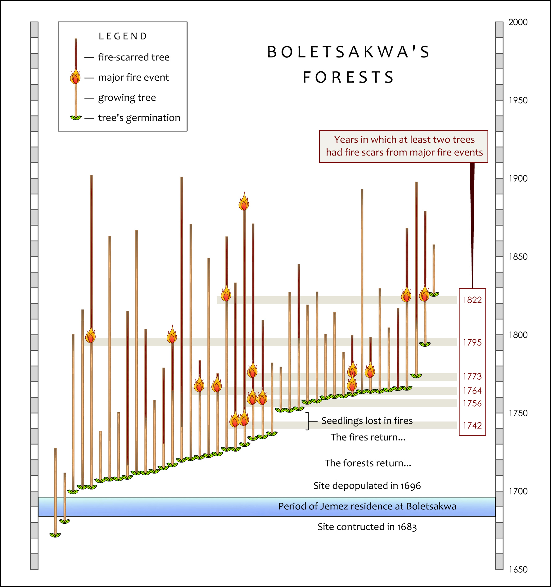
We can trust the text surrounding the chart to tell us the relevance of what’s going on here, but by using familiar visual cues (seedlings are green, flames are orange, trees grow up, not sideways) and sentence fragments in labeling (listing what’s happening over time), we hope to engage the reader long enough to discover new meanings behind the data.
Often a specialist’s deep understanding of an issue leads to overlapping visual ideas that are difficult for the non-specialist to tease apart. For example, I was given this original chart:

The reader’s mind is required to turn several mathematical corners to relate “numbers” and “percentages” to “time” here, while simultaneously interpreting the significance of the color blocks. I realized separating the main ideas would make them more accessible:
We still need the explanatory text, but in charting the evidence for the case, less is more.
Specialists often recognize that the go-to graphics they have used for years in reporting their interpretations of hard-won data are in need of a makeover. In this example, renowned geomorphologist Fred Nials combined annotated chart fragments to point the direction toward a new illustration (his comments are in red):
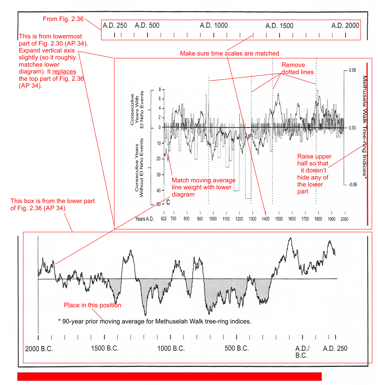
Making sense of both the data and the specialist’s vision for the revised graphic required an intense and thoroughly enjoyable one-on-one story-telling session with Fred. Then, with fingers crossed and the help of AutoCAD and Photoshop, I created this final product:
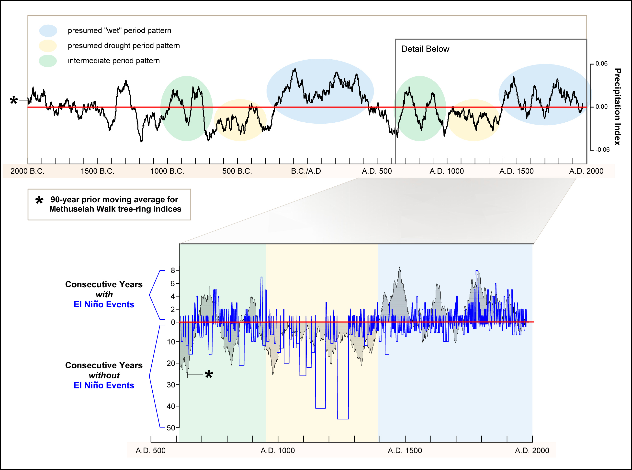
The 3-color scheme of weather patterns allows the eye to quickly perceive repetitions in the long timeline echoed in the detail of the last 1400 years. This serves as a grounding element. Further scrutiny of labels and lines will make the text come alive.
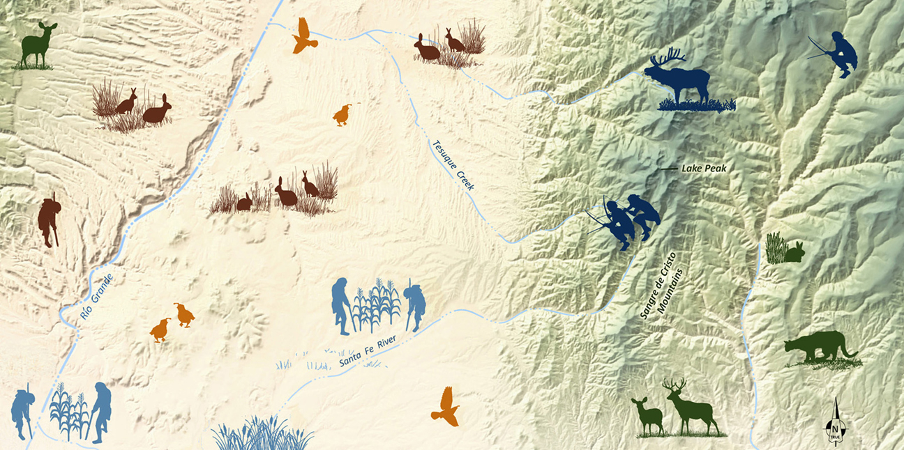
Sometimes a scientific illustration can be developed from nothing more than a list, as was the case when Desert Archaeology paleoethnobotanist Mike Diehl emailed me a list of the Tucson Basin’s environmental zones by elevation, along with a second list of the typical plants found in each zone. I created the following chart with three clicks of a mouse in a program called AllTopo Maps, which can chart elevations between any two points on a USGS 7.5 minute topographic map:
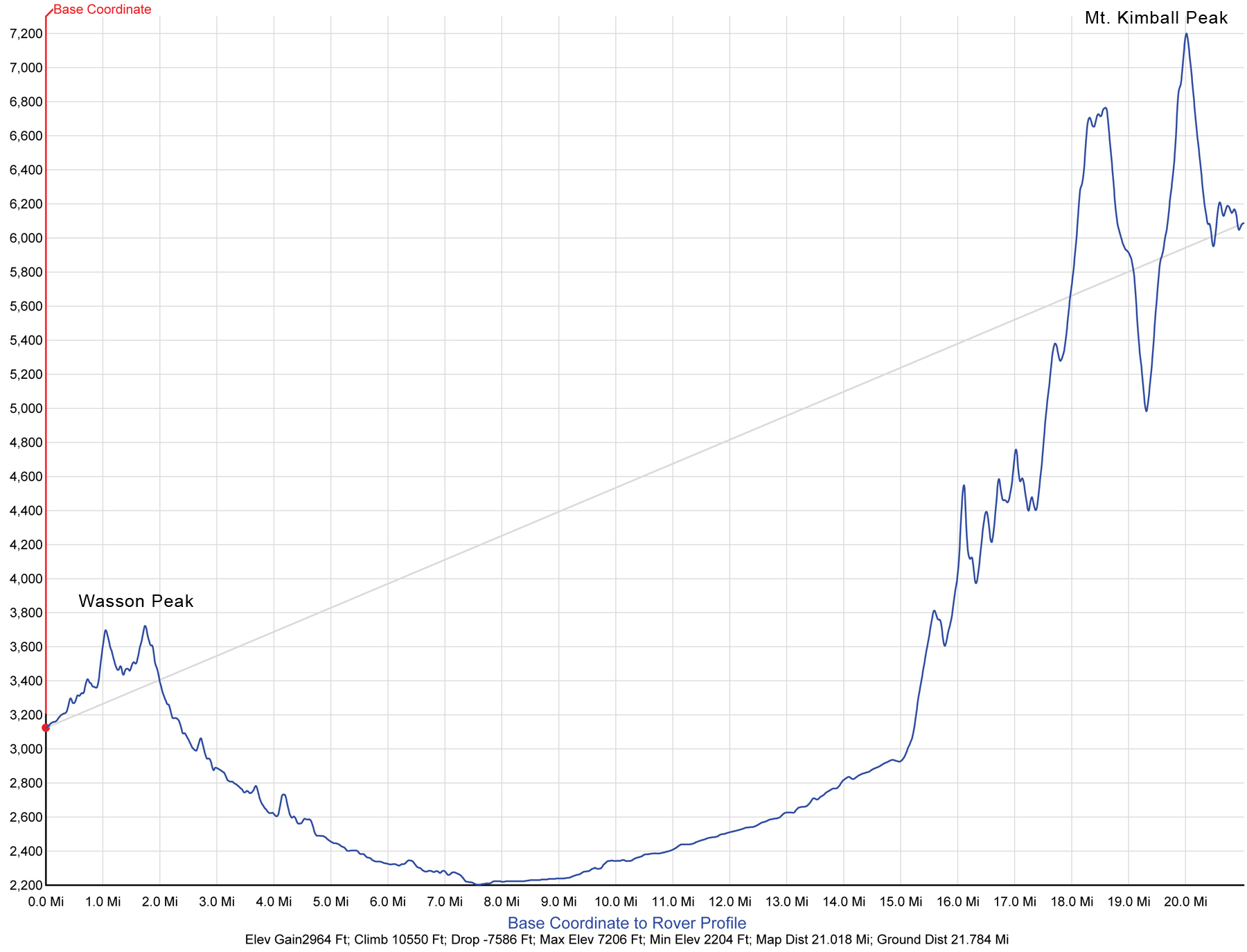
I imported the bare bones of this chart into AutoCAD, delineated elevation zones, added a dash of color… and now we have a visual understanding of plants we could expect to see walking across the Tucson Basin from Wasson Peak to Mt. Kimball:
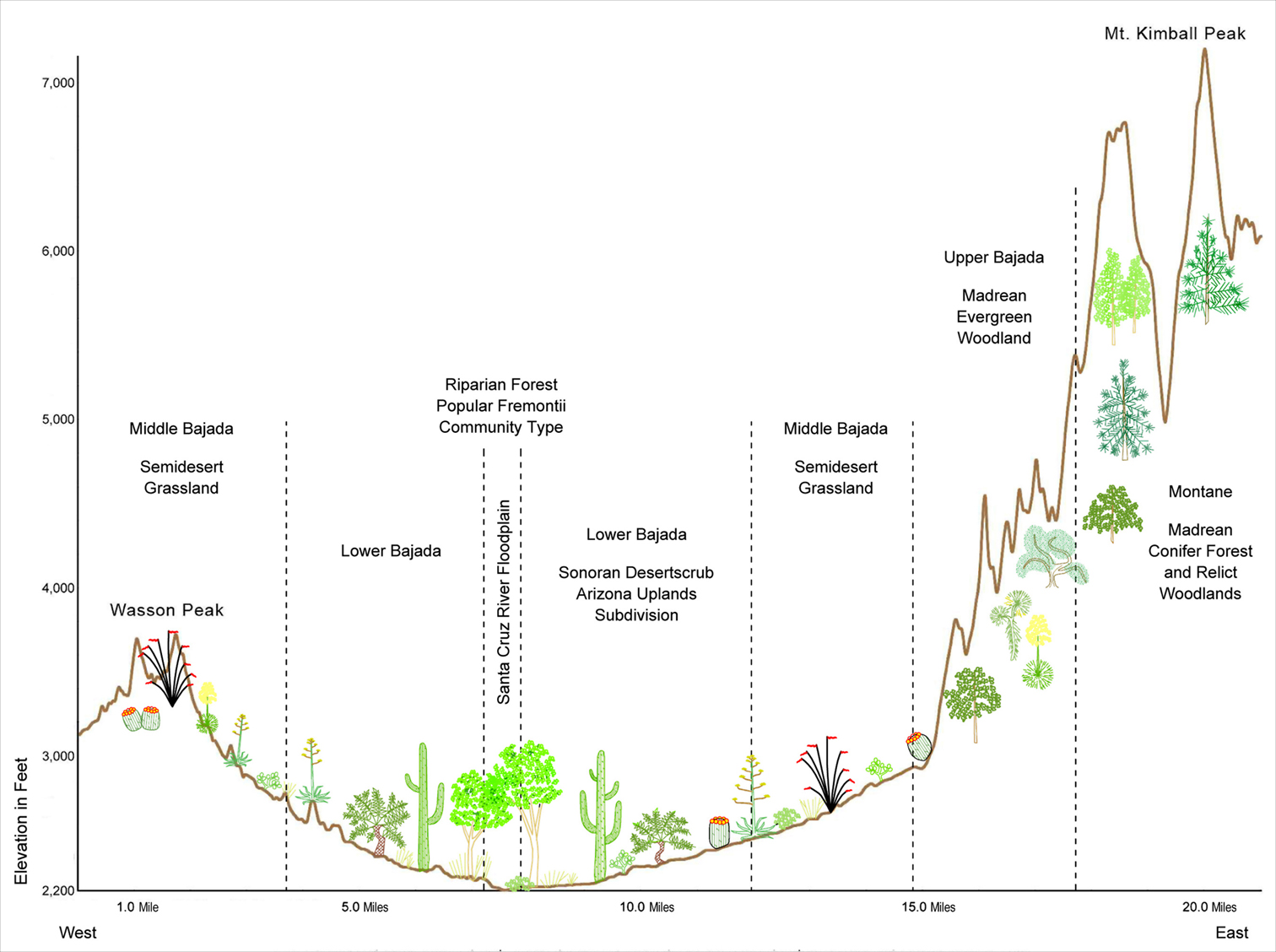
Combined with a detailed, hillshaded relief map, the reader is given a much clearer picture of the region than the printed word could express.
Pruning technical jargon and arcane symbology to create effective graphics is negotiated one author at a time. For me, the fun of creating graphical data interpretations is in first achieving a mind-meld with the expert, and then strategizing a new way to make complex ideas real to most readers. Popular magazines, books for all ages, museum signs, municipal planning documents, and web content benefit from innovative design ideas not typically found in academic or professional publications, and vice versa. At Desert Archaeology, we work with clients to design compelling graphics for every conceivable context.
If this approach sounds like the logical next step in communicating your latest concept to an audience outside your own head, please contact us to discuss modifications of current figures or whole new graphical possibilities. Where most see a dusty river cobble, I see the glint of turquoise and gold.
Notes and Resources
This blog entry leans on the relevance of plants in archaeology. Thanks to Christopher Roos, Josh Farella, Thomas W. Swetna, and Fred Nials for permission to show examples of their brilliant work.
For a revelatory look at how forest fires inform archaeology, check out this issue of Archaeology Southwest Magazine: Fire Adds Richness to the Land (Vol. 30, Issue Number 4.)
Fred Nials’ chart was published in The Anthropogenic Landscape of Las Capas, an Early Agricultural Irrigation Community in Southern Arizona.
Michael Diehl’s chart depicting the relationship of plant communities across the Tucson Basin was originally created for a 2015 American Antiquity article, but due to space constraints will be used instead in a future publication.